Visual programming
In this guide we will show how to use visual programming tools for accessing data from the SC API. In particular, we will work with the Orange data mining tool. This can be quite useful to introduce people to data in contexts when you don't want to code, but maybe web dashboards are too simple. This can be a great tool to teach math in class!
Installation
For this guide you will need to download Orange data mining. In principle with the installation bundle you will be OK, no need to install it via CLI unless you want to develop some modules yourself.
Once you have Orange, you will need to install the following add-ons:
Mecoda-orangeTimeseriesGeo(only in the case of using a GPS)
Installing add-ons
The process for installing add-ons is simple, but we detail it here for first-timers:
- Go to Options -> Add-ons... and you will see a window like this. Hit "Add more..."
-
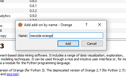
You will see a pop-up window asking for the name.
-
Write "mecoda-orange" and we press add.
- Do the same process for
timeseriesandgeo. -
Check the boxes as below. The Action column should say
Install. Hit OK.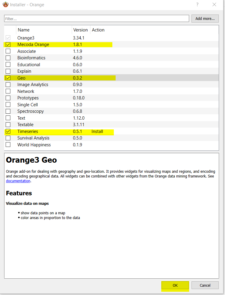
-
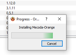
It may take some time to install the packages.
-
You may need to restart
Orangefor the changes to take effect.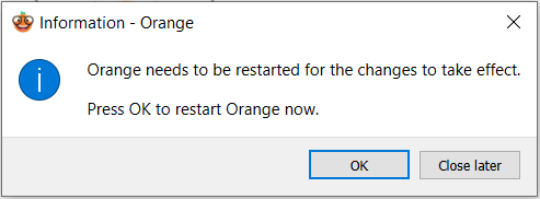
-
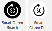
If all went well, in the panel to the left you will see new widgets available:
MECODA,Time Series,Geo - If you open MECODA, you will find the widgets for Smart Citizen (
Smart citizen SearchandSmart Citizen Data) among others.
Using the widgets
There are two widgets available for interacting with the Smart Citizen API: Smart Citizen Search and Smart Citizen Data. With the first, we will look for devices, and with the second we will get their data.
Searching devices
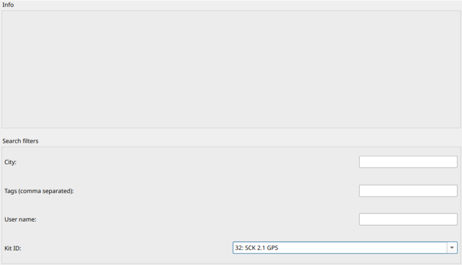
This the menu of the Smart Citizen Search:
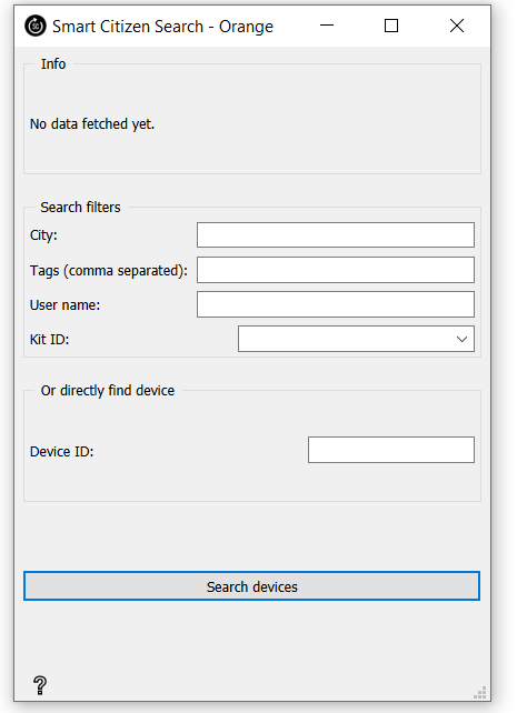
The info panel will get updated with data fetched from the Smart Citizen API once you hit "Search devices". In the bottom part also you can see how many devices have you retrieved from your query.
Search all?
If you press Search devices while there is no filter it's going to retrieve all the devices in the database, which is not necessarily a bad thing because you can filter/find yours after that.
The Search filters apply some filters in case that you rather get a list of devices, instead of a specific one:
- City: the city where devices are. First letter is uppercase and with the local denomination.
- Tags: tags can be input here separated with commas. If you look for indoor, online the widget is going to get all the kits that at least one of their tags are either indoor or online
- User name: the user that owns the device.
- Kit ID: filters by
kit id(i.e. the type of kit)
Already know the ID?
If you know the Device ID, you can input in the Device ID field. This will override any other search filter. Alternatively you can use the search filters to get a list of devices Device ID in a table and then lock the ID of the kit that you need information about
Getting the data
The Smart Citizen Data widget will retrieve the data from one device. It needs to have an Smart Citizen device as an input.
This is the menu of Smart Citizen Data:
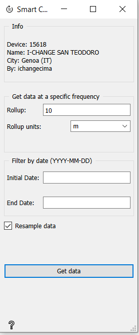
The info panel gets updated with the device basic information. If it's not connected it will be empty. When you press Get data, this panel will also how many rows it has retrieved from the API. In order to customise data frequency and dates, you can use the Get data at a specific fequency and Filter by date fields
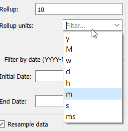
Options meaning
The options are y for years, M for months, w for weeks, d for days, h for hours, m for minutes, s for seconds and ms for milliseconds
No frequency, no data
This frequency is mandatory to be filled for the widget to work.
No date, all data
If this field is empty, the widget retrieves all the data on the record.
Finally, the resample data checkbox fills the missing data if it doesn't exist. Left unchecked will only get the data that is available.
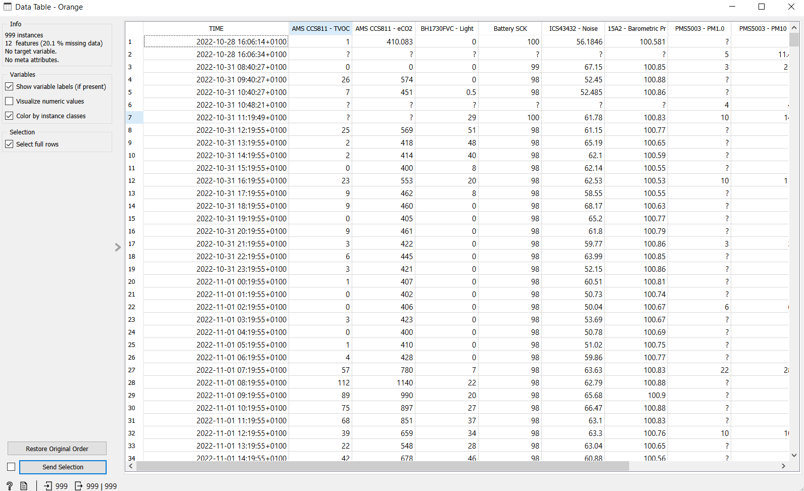
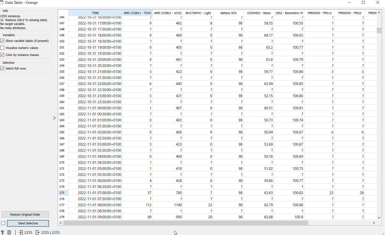
Differences in rollup
Example without resampling in a datatable: (rollout of 30 minutes)
Same example with resampling in a datatable: (rollout of 30 minutes)
Mecoda
Mecoda is a package of widgets for Orange to access data from Minka, Odour Collect, canAIRio, Ictio, Natusfera or Smart Citizen.
Installation steps are also explained here.
Examples
We will now look at some examples. You can get all example files from here.
Basic example
Start with this example is you haven't used Orange at all. It will create a very simple, but powerful, workflow.
Example file
This basic example uses the workflow file here
Search devices
-
Click on the widget of
Smart Citizen Search(on the widgets menu) from the MECODA extension. It will create the widget on the canvas on the right:
-
If you double click on the widget, a window will pop up with the available options:
-
As explained in the searching devices section, there are several options to find a kit.In this case we have already know which kit we'll use: https://smartcitizen.me/kits/15618 (in this case
15618).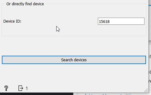
-
Hit search. You will get one result:
Play around with it
You can find many other interesting devices with this widget. You can display the devices with a Data Table.
Get data
-
Add another the
Smart Citizen Datawidget and connect both of them: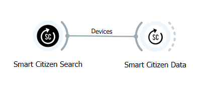
-
To see if everything is correct we can click on
Smart Citizen Dataand check it out. In theInfo panelyou will see the data we are about to load. -
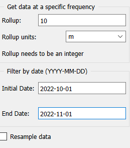
Next, define what data we want to download. In this example we're getting the data every 10 minutes and we want to get just data for one month. From 01/10/2022 to 30/10/2022. To do all that, we will set the rollup to 10 and the rollup units in m (minutes). We will set the Initial Date to 2022-10-01 and End Date to 2022-11-01. Keep the Resample data unchecked. You will have something like this:
-
Now we have to press Get data to fetch the data. It will take some seconds to fetch the data from the platform. Once it's done the Info panel will read:
Device 15618 data downloaded!
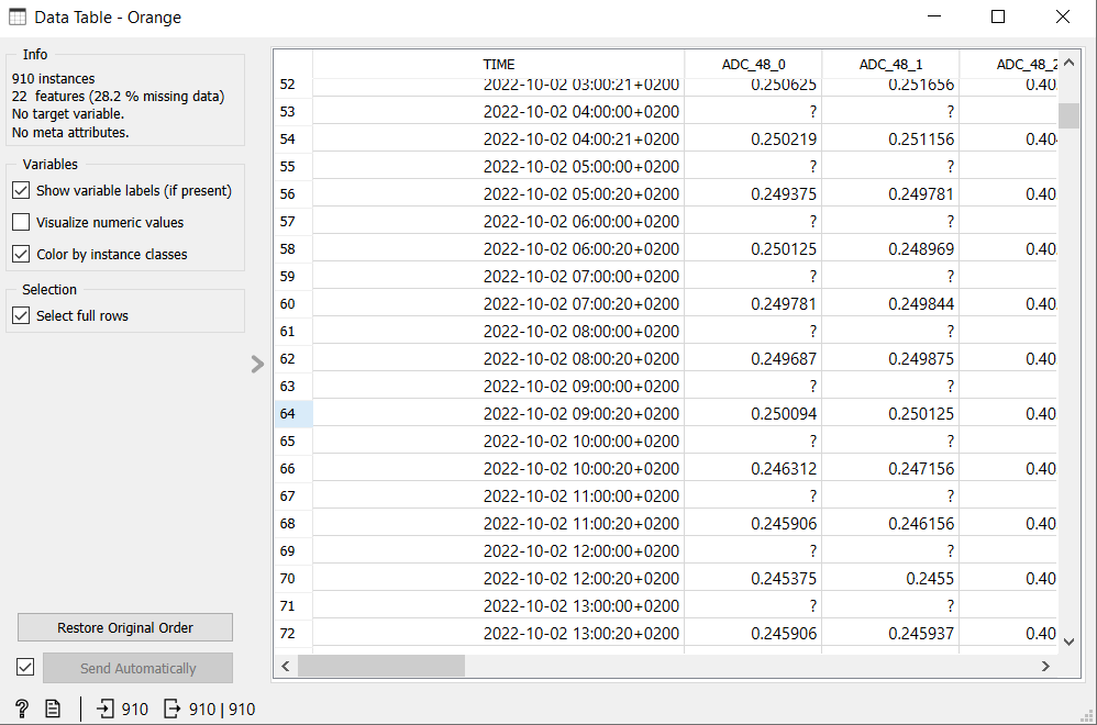
Data in a table
As an optional step, you can display the data in a table format. Place a Data table`` widget from the left menu inDataand connect it to theSmart Citizen Data`` widget:

If you double click on it, you'll see the data that you have downloaded:
More info?
The Data tables have more properties that are explained here https://orange3.readthedocs.io/projects/orange-visual-programming/en/latest/widgets/data/datatable.html
Plot it
-
To plot data, we need to first convert it to a
timeseries. Add aAs Timeserieswidget in theTime seriesmenu. Connect it to the output ofSmart Citizen Data: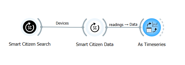
Timeseries not found?
Remember that timeseries is an extra add-on that you need to download.
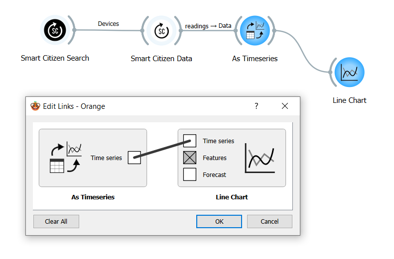
- Lastly, add a
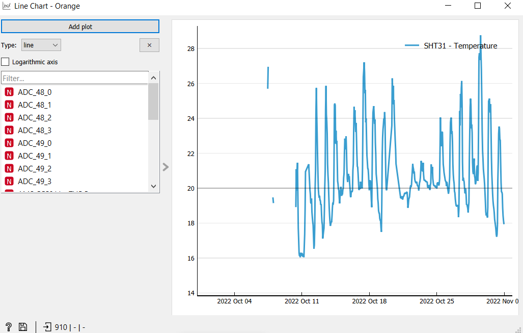
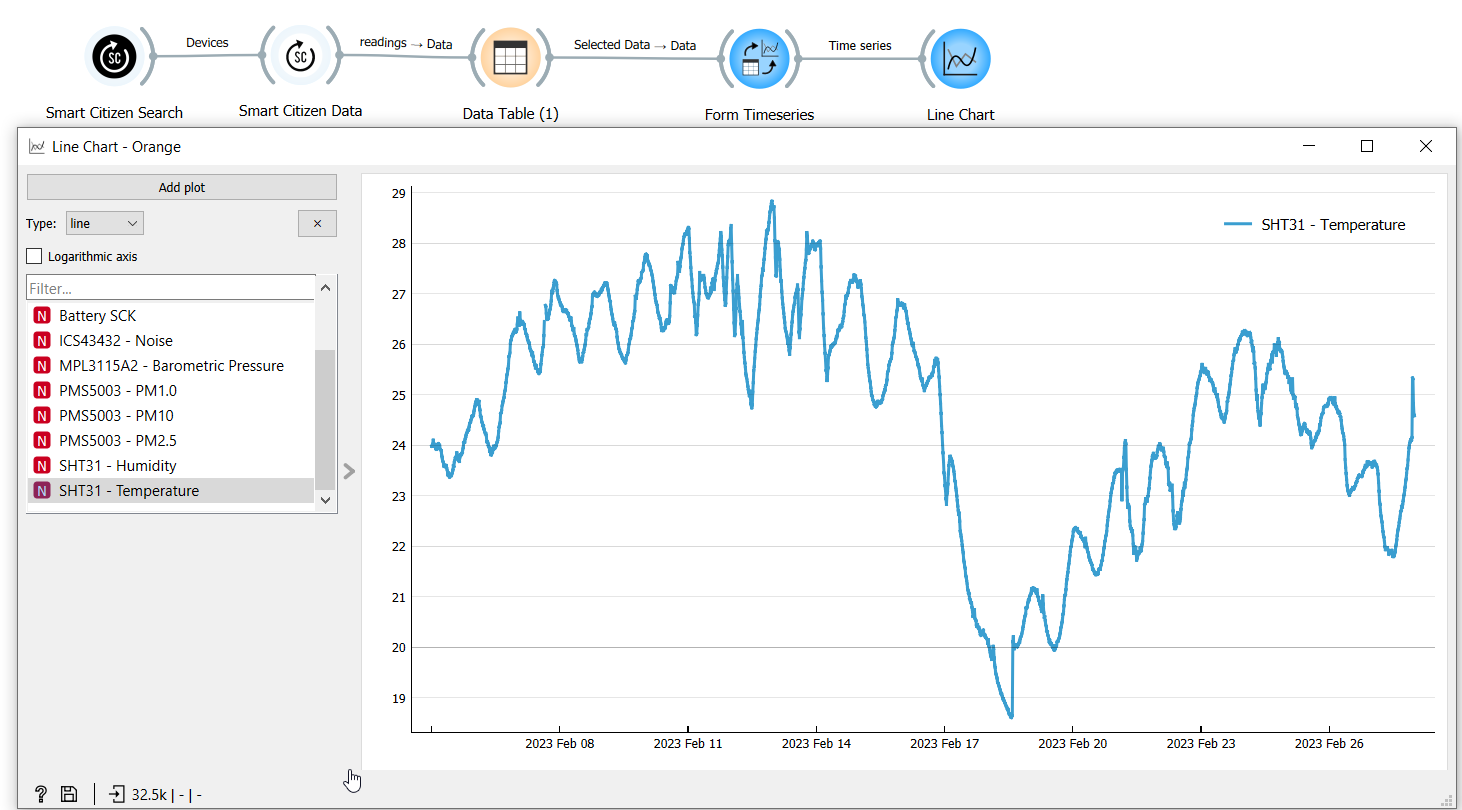
Line chart(in theTime Seriesmenu) and connect it to theAs timeseries. If theedit linkswindows shows up, select time series to time series as shown. If we click onLine Chart, it will show something like this:
Orange docs
For more information about this you can visit Orange documentation: https://orange3-timeseries.readthedocs.io/en/latest/widgets/line_chart.html#line-chart
-
Now you can select what data to plot. The chart below is done with one of the columns (in this case
Temperature). On the left we canAdd more plotsto compare them. For example to compare temperature and humidity: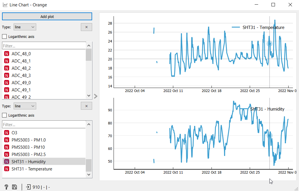
Done for today?
To save it and reuse later, or sharing your work, you can save the file as a .ows
Geolocated data
Example file
This geolocated example uses this workflow file
Building upon the previous example, we will now plot geolocated data on a map. Our basic setup is the same, except that this time we will use another device: 14471.
How to find other devices?
You can use the Smart Citizen Search to find other devices
By placing a Data Table before the Smart Citizen Data, you can look at the search results:
Then, select the row, and click on the Send automatically checkbox:
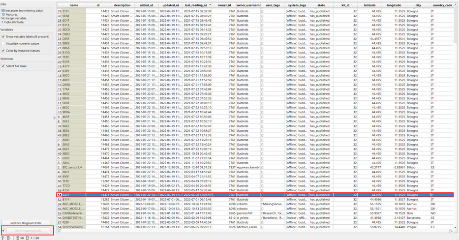
This will send the selected kit to the Smart Citizen Data widget.
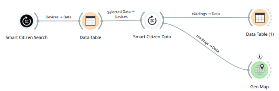
Now, you can go to the Geo panel to the left and click on Geo Map widget:
Then, connect the Data table into the Geo Map. If you double click on the geo map, you should see a nice looking map!:
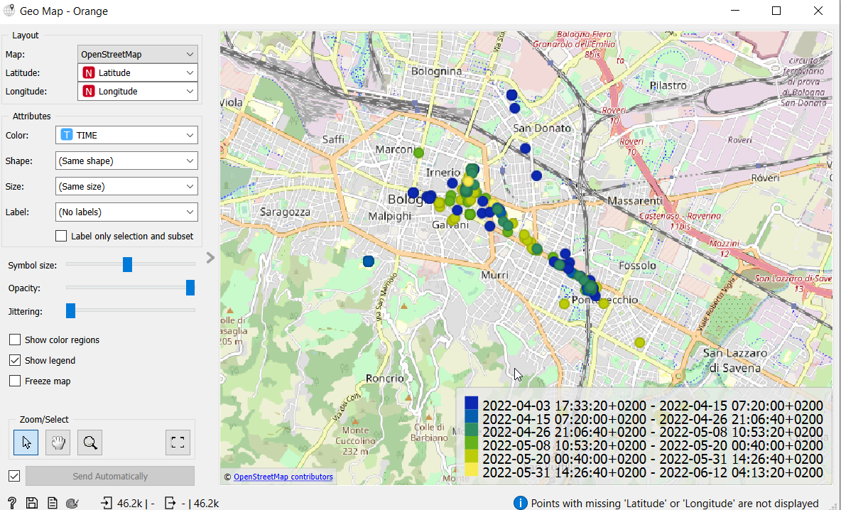
Changing colours and variables
We can adjust colors, sizes and parameters using the attributes on the left part of the GUI.
For changing the colour palletes use the widget Color between the Data Table and the Geo Map.
All the data that doesn't have latitude and longitude is ignored by default by the widget Geomap
Derivatives and averages
Finally, we can use Orange to understand, plot and tinker with math concepts such as averages and derivatives.
Orange workflow file
You can find this example here
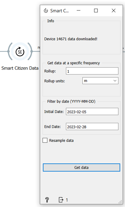
We will use data from an existing kit in Uruguay (14671). We will focus on the temperature data, but these tools are aplicable to any type of timeseries data. In this case we're getting the information in a rollup of 1 minute from 05/February to 28/February:
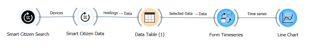
As before, we will add a Data table, and then plot it (As timeseries + Line Chart):
To see the temperature data we can open the line chart and choose to see the temperatures. We can see that we have som variations from day and night!
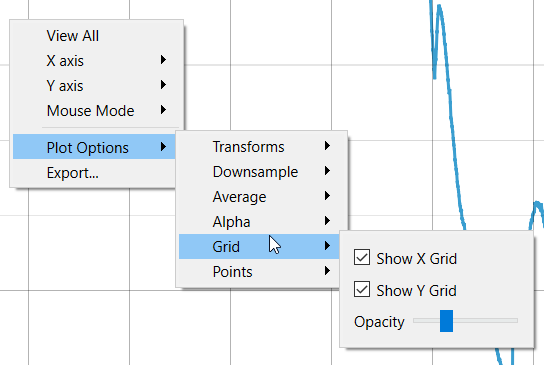
How to see the x-axis
To see the x-axis grid you need to right click on the graph, then plot options>grid and Show X grid.
Data aggregation by date
We will now use the Moving transform widget and connect it to the widget Form timeseries:
![]()
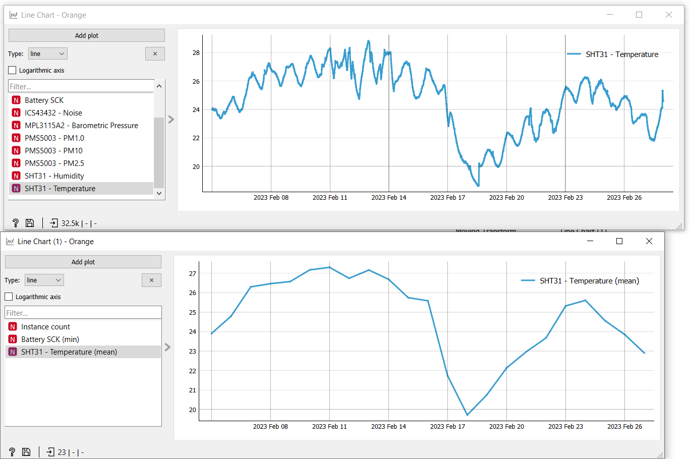
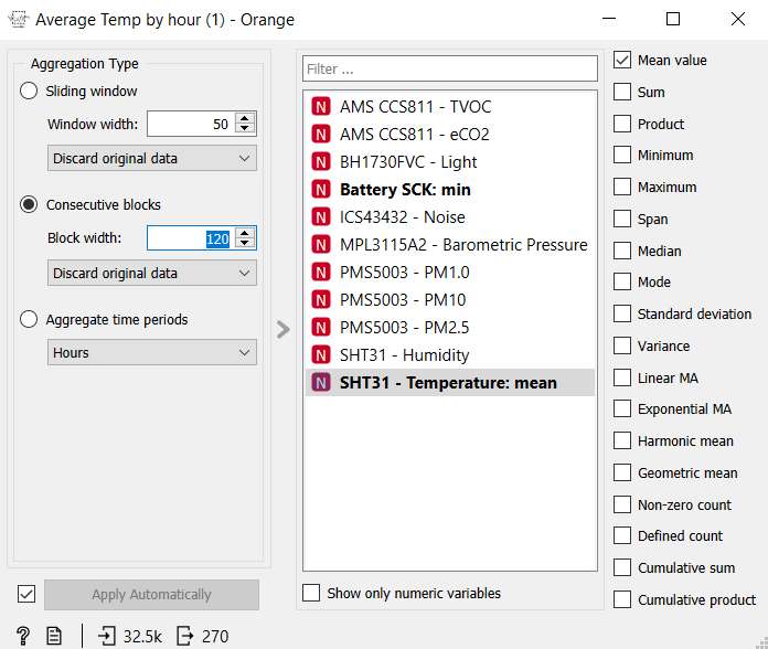
Inside Moving transform we can access to several types of aggregation/transformation. For the temperatures we're going to aggregate by 1 day and have a chart that takes the average of that day. We then select on the left column the Aggregate time periods and Days. Select Temperature in the column in the center, and in the column on the right Mean value.
![]()
Check that the output will be 23 (we have 23 days total) from the 32.5k total readings (wow!). If we plot them using another line chart we'll see that now we have taken out all the signal noise and we now have a cleaner plot:
Other averages
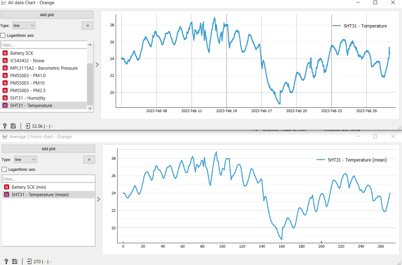
We can also average by hour. We can get some slight reduction on the noise but you will still get almost all the information about the peaks:
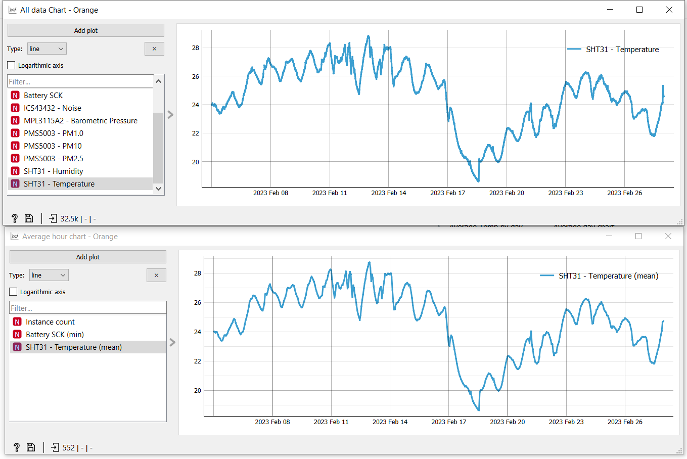
Now is time to explore! Maybe explore an average every 2 hours:
And these are the plots comparing the original with the 2 hours average.
Using derivatives
If we want to plot derivatives, we can do it in two different ways: directly on the graph, or using widgets. We're going to use the widgets.
Continuity
For the derivative to be accurate, we need continuity. For data that is not continuous, we use some linear interpolation to fill the missing data. In this case we're not missing a lot of data but maybe your data needs more interpolation!
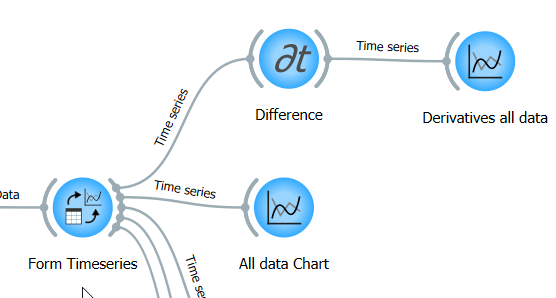
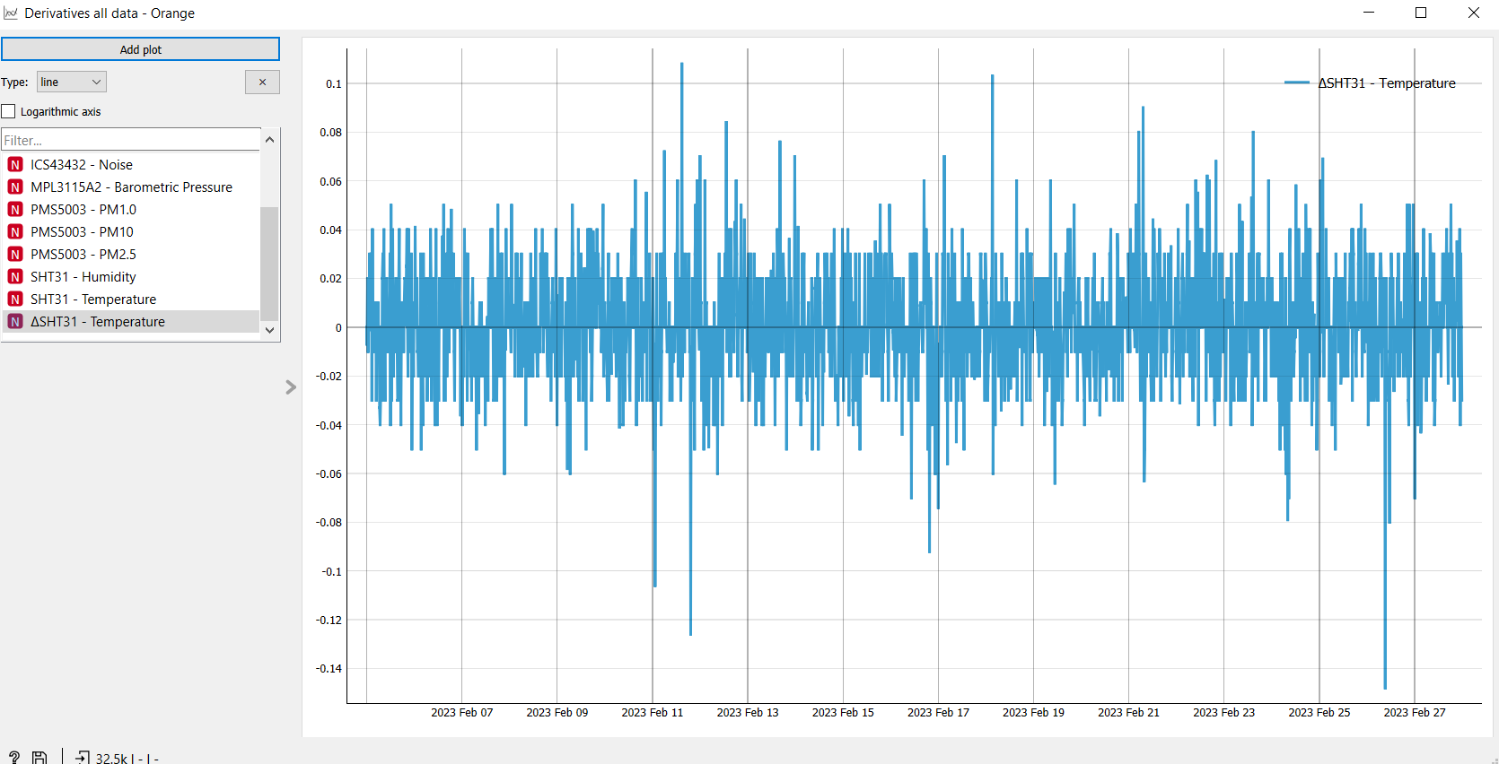
Select the Derivative widget from the menu. Then connect it to the Data table and then to the Line Chart:
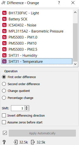
Next, select the options for the derivative (difference in the widget). In our case we're doing it on Temperature (over time):
Now, open the Line Chart and pick DeltaTemperature. It'll very likely be a very noisy chart (this is because here we are recording each minimum and maximum):
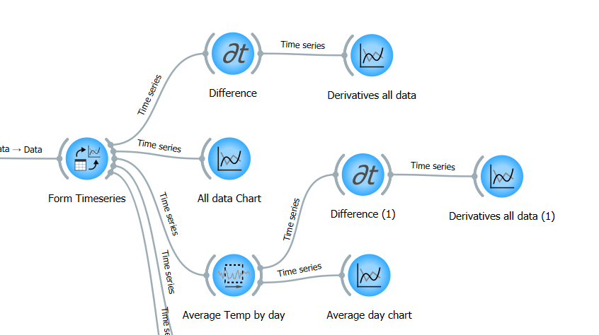
To make it a bit nicer, let's differenciate the arrays of averages that we did earlier on. Simply copy and paste the widgets of differenciation (or move the connection) to the other part of the outline (note that if you copy the widgets, you need to redo the configuration of the widget.)
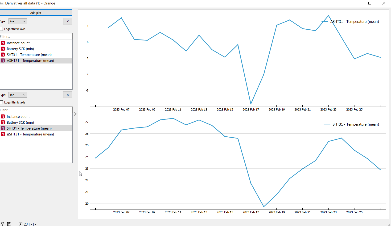
Finally, go to the line chart and compare between both signals, the original and the derivative:
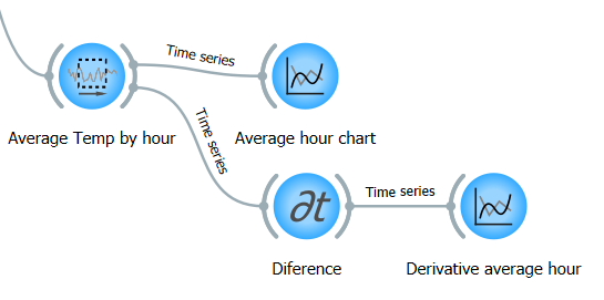
Finally, we can use the plot that we did before with the average hours, which will be a bit more detailed.
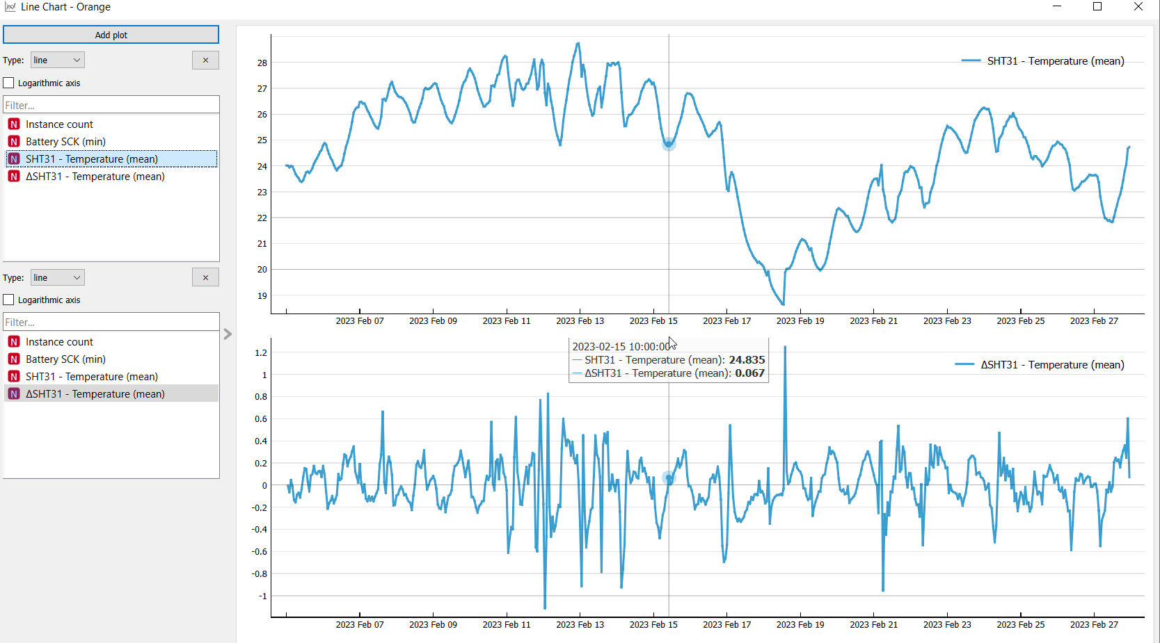
Information about derivatives
We can get the information here about the maxima and the minima. Each time the line of the derivative crosses 0 there is a local maxima or minima.
As a basic math concept, when the derivative is positive, it means that the temperature is rising, and when it's negative, it means temperature is decreasing.