Simple workflow for data analysis in Orange
This is a tutorial meant for someone who hasn't used Orange at all. It will create a very simple, but powerful, workflow.
Orange workflow file
This tutorial orange file can be downloaded from the repository in this folder: https://github.com/fablabbcn/smartcitizen-docs/tree/master/docs/assets/ows
The name of the file of this workflow is example_plot.ows
Requirements:
- Having installed
Orangeand the add-ons ofmecoda-orangeandtime series. Here you can see the tutorial - Knowing the particular device and the time range that you want to analyse
Look for the kit that you want to use
We're starting from scratch, a white canvas for this example.
Click on the widget of Smart Citizen Search (on the widgets menu) from the MECODA extension. It will create the widget on the canvas on the right:
If you click on the new item, a window will pop up with the available options:
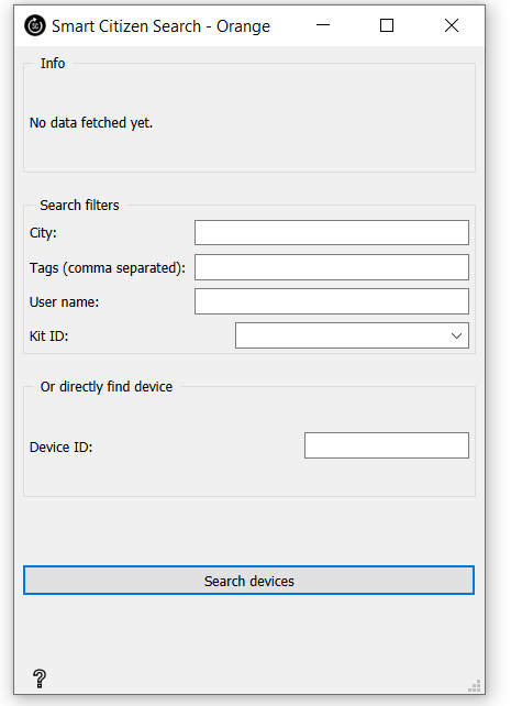
Here you can try to find your Kit. There are several options to retrieve this information but in this case we have the URL of our kit: https://smartcitizen.me/kits/15618. This URL tells us the Device ID that we want at the end of the URL (in this case 15618).
Using the map?
If you want to use the map to find your kit follow these instructions.
- Go to https://smartcitizen.me/kits/
- Find your kit in the map and select it. For example:

- When you select it the URL of the site will change, in this case to: https://smartcitizen.me/kits/15618
- Here you have the device id in the URL at the end. In this case it's 15618.
Once we have it, we type it or paste it in Device ID and press Search Devices:

It will tell us that we have just one result:
Now we found our device, we will get the data that is stored in it!
Get the data from the kit
We will now add another widget: this time, the Smart Citizen Data:

It will be set in the canvas near the other widget of Smart Citizen Search that we have already configured:
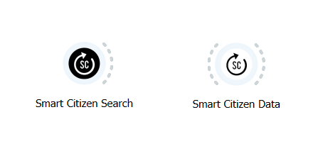
Now, we will connect both of them by pressing the dotted lines on the right of the Smart Cizizen Search and dragging the cursor into the Smart Citizen Data. Once you have it would look like this:
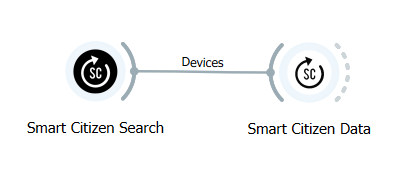
To see if everything is correct we can click on Smart Citizen Data and check it out:
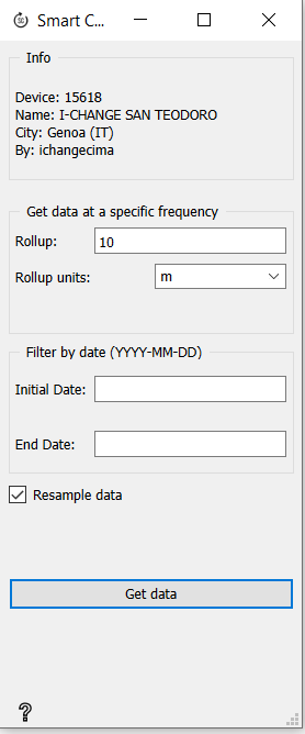
In the Info panel you will see the data we are about to load.
Now we will define what data we want to collect. In this example we're getting the data that we have every 10 minutes and we want to get just from one month. From 01/10/2022 to 30/10/2022. To do all that, we will set the rollup to 10 and the rollup units in m (minutes). (That's the setting by default). Then we set Initial Date to 2022-10-01 and End Date to 2022-11-01. And we tick off the box of Resample data. You will have something like this:
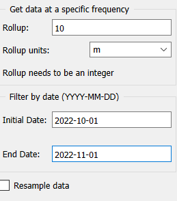
Now we have to press Get data to fetch the data.
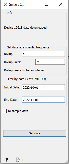
It will take some seconds to fetch the data from the platform. Once it's done the Info panel will read: Device 15618 data downloaded!
See the data in a table
As an optional step, we can look at the data in a table format. Place a Data table widget from the left menu in Data:
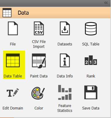
We click on it as we have clicked on other widgets and it will appear on the canvas:
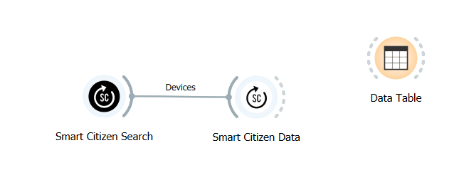
We connect it to the Smart Citizen Data by dragging it's output to the Data Table like this:
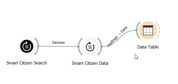
If we open it, we'll see the data that we have gathered:

More info?
The Data tables have more properties that are explained here https://orange3.readthedocs.io/projects/orange-visual-programming/en/latest/widgets/data/datatable.html
Set the data as timeseries
To plot data, we need to first set it a timeseries. Add a As Timeseries widget in the menu timeseries.

Timeseries not found?
Remember that timeseries is an extra add-on that you need to download. Here's how you can do it
As usual, if we click it, it will appear on the canvas:

We connect it to the Smart Citizen Data by dragging it's output to the As Timeseries like this:

Plot the results
Lastly, we create one more widget: Line chart (in the menu Time Series):

We click it and it will appear in the canvas:

We connect it to the As Timeseries dragging the data from the As Timeseries to the Line chart like this:
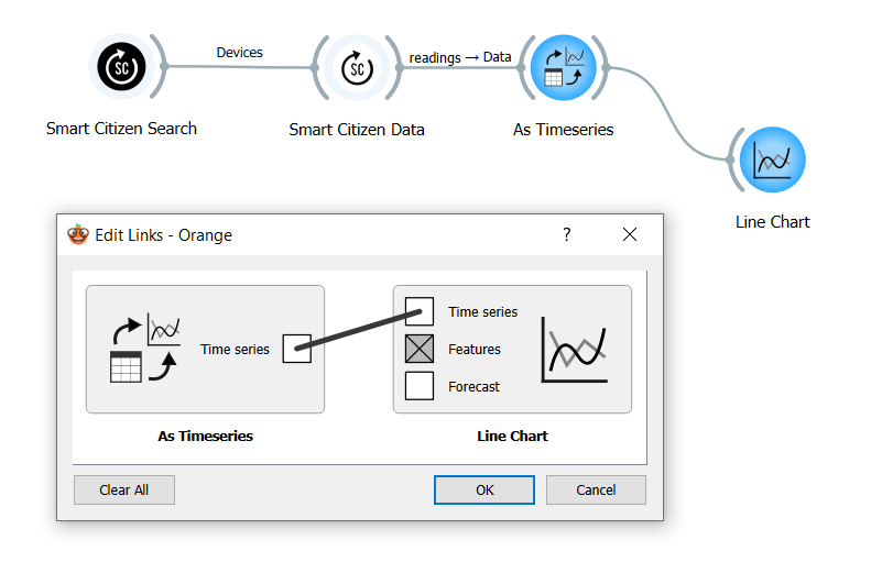
If the edit links windows shows up, select time series to time series as shown. If we click on Line Chart, it will show something like this:

Orange docs
For more information about this you can visit Orange documentation: https://orange3-timeseries.readthedocs.io/en/latest/widgets/line_chart.html#line-chart
This chart is done with one of the columns (in this case Temperature). On the left we can Add more plots to compare them. For example to compare temperature and humidity:

To select the type of data that we want to check we need only to get the appropiate sensor and select it.
Done for today?
To save it and reuse later, or sharing your work, you can save the file as a .ows